appearances
Each appearance creates a custom
appearance object.
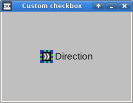
uigenerator3.C
creates a checkbox with a custom
visual appearance. The default checkbox image gets replaced with
a chevron that alternates between pointing left and right, with
a large, blocky input focus frame around it.
<?xml version="1.0" encoding="utf-8"?>
<theme version="1"
       xmlns:xi="http://www.w3.org/2003/XInclude">

  <dim id="cell-padding">20</dim>

  <color id="focusoff">
    <r>.8</r>
    <g>.8</g>
    <b>.2</b>
  </color>

  <color id="focuson1">
    <r>.2</r>
    <g>.2</g>
    <b>.8</b>
  </color>

  <color id="focuson2">
    <r>.2</r>
    <g>.8</g>
    <b>.2</b>
  </color>

  <border id="custom-focusoff">
    <color>focusoff</color>
    <width>1</width>
    <height>1</height>
  </border>

  <border id="custom-focuson" from="custom-focusoff">
    <color>focuson1</color>
    <color2>focuson2</color2>
    <dash>1</dash>
  </border>

  <appearance id="custom-checkbox-focus-border" type="focus_border">
    <focusoff_border>custom-focusoff</focusoff_border>
    <focuson_border>custom-focuson</focuson_border>
  </appearance>

  <appearance id="custom-checkbox" type="image_button">
    <images>
      <reset />
    </images>

    <focus_border>custom-checkbox-focus-border</focus_border>

    <images>scroll-left1</images>
    <images>scroll-right1</images>

  </appearance>

  <layout id="main-window-grid" type="grid">

    <padding>
      <row>0</row>
      <side>top</side>
      <padding>cell-padding</padding>
    </padding>
    <padding>
      <row>0</row>
      <side>bottom</side>
      <padding>cell-padding</padding>
    </padding>

    <padding>
      <col>0</col>
      <side>left</side>
      <padding>cell-padding</padding>
    </padding>
    <padding>
      <col>1</col>
      <side>right</side>
      <padding>cell-padding</padding>
    </padding>
    <valign>
      <row>0</row>
      <valign>middle</valign>
    </valign>
    <append_row>
      <name>main-window-contents</name>
    </append_row>
  </layout>

  <factory id="main-window-contents" type="grid">
    <element>
      <name>checkbox</name>
    </element>
    <element>
      <name>label</name>
    </element>
  </factory>

</theme>
Each appearance must have a unique
id and a valid
type. The first occurence of an
appearance with a designated
id takes effect, and subsequent
appearances with the same
id get ignored.
Creating and using appearance objects
auto generator=x::w::const_uigenerators::create("uigenerator3.xml");

// ...

factory->create_checkbox(generator->lookup_appearance("custom-checkbox"));
A generator's
lookup_appearance returns an appearance
object specified by its “id”. This theme file creates
an appearance object named “custom-checkbox”, and
lookup_appearance() returns it. This gets
passed to a factory's create_checkbox()
that takes an optional appearance object as a parameter, and this
sets the new checkbox's appearance using the specified appearance
object.
lookup_appearance() returns a generatic
x;::w::const_appearance object from which
all appearance objects get derived from. The following table lists
all appearance object classes and the
types which create them.
appearance 's optional
from attribute specifies another,
“parent”
appearance that this
appearance gets based from.
The following table lists all available appearance
types, and the resulting appearance
object class.
from specifies either:
The
idof another, parent appearance object.One of the built-in themes from the following table. The default built-in theme gets used when a
fromparent does not get specified.
type=" | Appearance object | Built-in themes |
|---|---|---|
|
| |
|
| |
|
| |
|
| |
|
| |
|
| |
|
| |
|
| |
|
| |
|
| |
|
| |
|
| |
|
| |
|
| |
|
| |
|
| |
|
| |
|
| |
|
| |
|
| |
|
| |
|
| |
|
| |
|
| |
|
| |
|
| |
|
| |
|
| |
|
|
Contents of appearances in theme files
<appearance id="custom-checkbox-focus-border" type="focus_border">
  <focusoff_border>custom-focusoff</focusoff_border>
  <focuson_border>custom-focuson</focuson_border>
</appearance>
Each
appearance contains elements whose names
match the names of the fields in the corresponding appearance classes.
A focus
border appearance object contains two fields,
focusoff_border, and
focuson_border, and an
appearance with a
focus_border type
specifies their values accordingly.
If not explicitly specified,
the value of each field comes from the parent
appearance, explicitly specified by the
from attribute, or the default parent.
The fields get specified as follows:
-
std::stringfields <images>scroll-left1</images>
std::stringvalues get specified directly.-
x::w::border_argfields <focuson_border>custom-focuson</focuson_border>
x::w::border_argvalues are areids ofborders in the theme file. They may also reference borderids from the current display theme, but this is not documented. A more future-proof way of borrowing a standard theme border is to use one of the built-in theme appearance objects as the parent object and not changing the existingx::w::border_argvalue.-
x::w::color_argandx::w::text_color_argfields <color2>focuson2</color2>
Color values are are
ids ofcolors in the theme file. They may also reference borderids from the current display theme, but this is not documented. A more future-proof way of borrowing a standard theme border is to use one of the built-in theme appearance objects as the parent object and not changing the existing color value.Color values may also reference standard HTML 3.2 colors.
-
x::w::dim_argfields <dim id="cell-padding">20</dim> <scroll_button_height>cell-padding</scroll_button_height>
x::w::dim_argvalues are areids ofdims in the theme file. They may also reference borderids from the current display theme, but this is not documented. A more future-proof way of borrowing a standard theme border is to use one of the built-in theme appearance objects as the parent object and not changing the existingx::w::dim_argvalue.-
x::w::font_argfields <shortcut_font>small</shortcut_font>
x::w::font_argvalues are areids offonts in the theme file. They may also reference borderids from the current display theme, but this is not documented. A more future-proof way of borrowing a standard theme border is to use one of the built-in theme appearance objects as the parent object and not changing the existingx::w::font_argvalue.See the section called “Specifying fonts” for more information on how to define custom
fonts.-
x::w::halignfields <horizontal_alignment>center</horizontal_alignment>
These fields contain
x::w::halignvalues.-
x::w::scrollbar_visibilityfields <pane_scrollbar_visibility>automatic</pane_scrollbar_visibility>
These elements contain
x::w::scrollbar_visibilityvalues.-
x::w::text_paramfields <font id="ok_font"> <family>liberation mono</family> <point_size>18</point_size> </font> <ok_label>${font:ok_font}Ok</ok_label>These fields contain
x::w::text_paramvalues.-
x::w::valignfields <vertical_alignment>middle</vertical_alignment>
These fields contain
x::w::valignvalues.-
x::w::const_fieldstype_apperance <focus_border>custom-checkbox-focus-border</focus_border>
std::optional and std::vector fields
<images>
  <reset />
</images>

<images>scroll-left1</images>
<images>scroll-right1</images>
A new
appearance element starts with the values of all fields
copied from its parent appearance object, then each value in the
appearance element replaces the value of the
corresponding field in the
new appearance object.
Some fields in appearance objects are std::optional or
std::vectors.
Each value of a
std::vector field gets appended to a vector.
Specifying a
reset for a
std::vector value
erase()s its existing contents.
Specifying a
reset for a
std::optional reset()s its value.
New values of a std::vector usually gets specified after
reseting the values it inherited from its parent
appearance object.