Chapter 14. Checkboxes and radio buttons
Index
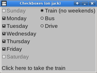
This example creates a window with some checkboxes and radio buttons.
/*
** Copyright 2017-2021 Double Precision, Inc.
** See COPYING for distribution information.
*/

#include "config.h"
#include "close_flag.H"

#include <x/exception.H>
#include <x/destroy_callback.H>
#include <x/appid.H>

#include <x/w/main_window.H>
#include <x/w/gridlayoutmanager.H>
#include <x/w/gridfactory.H>
#include <x/w/label.H>
#include <x/w/canvas.H>
#include <x/w/container.H>
#include <x/w/image_button.H>
#include <x/weakcapture.H>

#include <vector>
#include <tuple>
#include <string>

std::string x::appid() noexcept
{
	return "checkradio.examples.w.libcxx.com";
}

typedef std::vector<std::tuple<std::string, x::w::image_button>> buttons_t;

// The radio button for "Train" has a different label depending on whether
// the "Train" radio button is selected, or not.
//
// This is called from the radio button's callback, to update the radio
// button's label, and from create_radio(), to set the radio button's
// initial label. Both instances have a factory that's used to create the
// actual label, so this works out nicely.

void set_train_label(const x::w::factory &f, bool is_selected)
{
	f->create_label(is_selected ? "Train (no weekends)":"Train")

		// Once everything gets created, it's show_all()ed. But when
		// this is called to update the radio button's label, it is
		// our responsibility to show() the new display element.
		->show();
}

// Factored out for readability. This is the main part of the callback for
// the "Train" radio button, that's installed below.

void train_radio_callback(const x::w::image_button &train,

			  // Whether the radio button is now selected.
			  bool selected,

			  // The two checkboxes:

			  const x::w::image_button &saturday,
			  const x::w::image_button &sunday)
{
	std::cout << "Train: "
		  << (selected ? "":"not ")
		  << "checked"
		  << std::endl;

	// ... enable and disable the sunday and
	// saturday checkboxes.
	//

	sunday->set_enabled(!selected);
	saturday->set_enabled(!selected);

	// And update the label for the "Train"
	// radio button.

	train->update_label([selected]
			    (const x::w::factory &f)
			    {
				    set_train_label(f, selected);
			    });
}

// This is the creator lambda, that gets passed to create_mainwindow() below,
// factored out for readability.

void create_mainwindow(const x::w::main_window &main_window,
		       buttons_t &buttons)
{
	auto layout=main_window->gridlayout();

	static const char * const days_of_week[]={
		"Sunday",
		"Monday",
		"Tuesday",
		"Wednesday",
		"Thursday",
		"Friday",
		"Saturday"};

	std::vector<x::w::image_button> days_of_week_checkboxes;

	int n=0;

	// In the first column of each row put a checkbox.
	// Create a label in the second column of each row, with the name
	// of the day of the week.

	for (auto day_of_week:days_of_week)
	{
		++n;

		x::w::gridfactory factory=layout->append_row();

		x::w::image_button checkbox=
			// Add some padding to provide some separation from the
			// second set of columns with radio buttons, that
			// we'll add below.
			factory->right_padding(3)
			.create_checkbox([&]
					 (const x::w::factory &label_factory)
					 {
						 label_factory->create_label(day_of_week);
					 });


		// Set Monday through Friday checkboxes to value #2,
		// "indeterminate" state.
		if (n > 1 && n < 7)
			checkbox->set_value(2);

		// Install a callback that gets invoked whenever the checkbox
		// changes state.
		checkbox->on_activate([day_of_week]
				      (ONLY IN_THREAD,
				       size_t flag,
				       const x::w::callback_trigger_t &trigger,
				       const auto &ignore)
				      {
					      if (trigger.index() ==
						  x::w::callback_trigger_initial)
						      return;

					      std::cout << day_of_week
							<< ": "
							<< (flag ? "":"not ")
							<< "checked"
							<< std::endl;
				      });
		days_of_week_checkboxes.push_back(checkbox);

		buttons.push_back({day_of_week, checkbox});
	}

	// Append more columns to row #0.
	auto factory=layout->append_columns(0);

	// Create the "Train" button, initially set.

	x::w::image_button train=
		factory->create_radio(
			"checkradiogroup@checkradio.examples.w.libcxx.com",
			[]
			(const x::w::factory &f)
			{
				// And the "set" label.
				set_train_label(f, true);
			});

	// Set this radio button.
	train->set_value(1);

	// Whenever this checkbox is enabled, the "sunday" and "saturday"
	// checkboxes are disabled. Since the initial state of this radio
	// button is the set state, we'll disable them right off the bat.

	auto sunday=*days_of_week_checkboxes.begin();
	auto saturday=*--days_of_week_checkboxes.end();

	sunday->set_enabled(false);
	saturday->set_enabled(false);

	// Install an on_activate() callback for the "Train" radio button,
	//
	// Note that this callback captures
	// references to the saturday and sunday display elements.
	//
	// Since all of these display elements are
	// in the same main window and neither one
	// is the parent of the other, when the
	// main window gets destroyed, it drops its
	// references on all these elements,
	// including the "train" checkbox, whose
	// callback has these captures. The
	// "train" element, and its callback, get
	// destroyed, destroying the captured
	// references too, allowing these display
	// elements to be destroyed as well.
	//
	// However, the callback also needs to capture a reference to its own
	// display element, and this obviously needs to be a weak reference.

	train->on_activate([saturday, sunday,
			    train=x::make_weak_capture(train)]
			   (ONLY IN_THREAD,
			    size_t flag,
			    const x::w::callback_trigger_t &trigger,
			    const auto &ignore2)
			   {
				   // Ignore this for the initial callback.

				   if (trigger.index() ==
				       x::w::callback_trigger_initial)
					   return;

				   // Recover the weak reference.

				   auto got_ref=train.get();

				   if (!got_ref)
					   return;

				   auto & [train]= *got_ref;

				   // Now, run the main logic of this callback.
				   train_radio_callback(train, flag > 0,
							saturday, sunday);
			   });

	// Append more columns to row #1.

	factory=layout->append_columns(1);

	// Create a "bus" radio button and label.
	x::w::image_button bus=
		factory->create_radio(
			"checkradiogroup@checkradio.examples.w.libcxx.com",
			[]
			(const x::w::factory &f)
			{
				f->create_label("Bus");
			});

	bus->on_activate([]
			 (ONLY IN_THREAD,
			  size_t flag,
			  const x::w::callback_trigger_t &trigger,
			  const auto &ignore)
			 {
				 if (trigger.index() ==
				     x::w::callback_trigger_initial)
					 return;

				 std::cout << "Bus: "
					   << (flag ? "":"not ")
					   << "checked"
					   << std::endl;
			 });

	// Append more column to row #2

	factory=layout->append_columns(2);
	x::w::image_button drive=
		factory->create_radio(
			"checkradiogroup@checkradio.examples.w.libcxx.com",
			[]
			(const x::w::factory &f)
			{
				f->create_label("Drive");
			});

	drive->on_activate([]
			   (ONLY IN_THREAD,
			    size_t flag,
			    const x::w::callback_trigger_t &trigger,
			    const auto &ignore)
			   {
				   if (trigger.index() ==
				       x::w::callback_trigger_initial)
					   return;

				   std::cout << "Drive: "
					     << (flag ? "":"not ")
					     << "checked"
					     << std::endl;
			   });

	// We create two more columns in rows 0 through 2. Grids should have
	// the same number of columns in each row, so what we'll do is use
	// create_canvas() to create an empty display element in rows 3 through
	// 6. Use colspan() to have the canvas span the two extra columns
	// that are taken up by the radio buttons.

	for (size_t i=3; i<7; ++i)
		layout->append_columns(i)->create_canvas();

	factory=layout->append_row();

	// A single element in the last row, spanning both columns, and
	// with some extra spacing above it.

	factory->colspan(2).top_padding(4);

	auto bottom_label=factory->create_label("Click here to take the train");

	// A separate display element that's considered to be an independent
	// "label" for a checkbox or a radio button. Clicking on this label
	// is equivalent to clicking on the "Train" radio button.
	//
	// The parameter to label_for must be a focusable display element.

	bottom_label->label_for(train);
}

void checkradio()
{
	x::destroy_callback::base::guard guard;

	auto close_flag=close_flag_ref::create();

	buttons_t buttons;

	auto main_window=x::w::main_window::create
		([&]
		 (const auto &main_window)
		 {
			 create_mainwindow(main_window, buttons);
		 });

	main_window->on_disconnect([]
				   {
					   _exit(1);
				   });

	guard(main_window->connection_mcguffin());

	main_window->set_window_title("Checkboxes");

	main_window->on_delete
		([close_flag]
		 (ONLY IN_THREAD,
		  const x::w::busy &ignore)
		 {
			 close_flag->close();
		 });

	main_window->show_all();

	close_flag->wait();

	// Read the final values of the days of week checkbox.

	for (const auto &checkbox:buttons)
		std::cout << std::get<std::string>(checkbox)
			  << ": "
			  << std::get<x::w::image_button>(checkbox)->get_value()
			  << std::endl;
}

int main(int argc, char **argv)
{
	try {
		checkradio();
	} catch (const x::exception &e)
	{
		e->caught();
		exit(1);
	}
	return 0;
}
Creating checkboxes and radio buttons
A factory's
create_checkbox() and
create_radio() and methods return an
x::w::image_button,
which is a focusable.
The only difference between
create_checkbox() and
create_radio() is
create_radio()'s first parameter which is
a radio button group identifier. All radio buttons in the same window
with the same identifer form a radio button group.
Radio buttons in the same radio button group are mutually exclusive
with each other.
Selectable menu options also have optional radio group identifiers, that form a mutually-exclusive list of options selected from popup menus.
Radio group identifiers
Radio group identifiers are opaque, unique labels. For future use,
radio group identifiers should use the following naming conventions.
Applications should use identifiers formatted as Internet
hostnames or E-mail addresses using domain names that belong to the
application. An application developed by
example.com
can use “radiogroup1@example.com”, or
“radiogroup@app1.example.com”, as an example.
LibCXXW's internal radio group identifiers use
“@libcxx.com” to avoid application conflicts:
LibCXXW handles radio button identifiers as opaque text strings.
Button labels
Traditionally, a brief text label appears next to each
x::w::image_button.
The first parameter to create_checkbox()
and the second parameter to create_radio()
is a closure, or a callable object. The callable object
receives one parameter: a factory that the closure should use
to create one widget.
The traditional x::w::image_button
label is, well, a label
created by create_label() but it
can be any widget.
This sets the checkbox's, or the radio button's initial label.
An existing
x::w::image_button's
update_label() method replaces its
existing label using the same approach.
checkradio.C gives an example of updating
one of the radio button's labels when the radio button gets selected
and de-selected:
void set_train_label(const x::w::factory &f, bool is_selected)
{
    f->create_label(is_selected ? "Train (no weekends)":"Train")->show();
}

// ...

train->update_label([selected]
                    (const x::w::factory &f)
                    {
                        set_train_label(f, selected);
                    });
}
Note
The label, like any other widget, must be
show()n to be visible.
Customizing x::w::image_button labels
It is possible to use create_label() to
construct a lengthy, word-wrapped label for an
x::w::image_button,
which appears immediately after it.
By default, the button and its following label are vertically
centered with respect to each other. This may not look very well
with tall labels.
The last optional parameter to
create_checkbox() and
create_radio()
is an
x::w::image_button_appearance object, a
reference-counted object.
Actually it's an
x::w::const_image_button_appearance
that references a const object.
This is a common LibCXXW design pattern: an
“appearance object”.
This object specifies various appearance-related properties of
a widget.
The default appearance object is cached, which is why it is a constant
object. An appearance object's modify() creates
a duplicate copy of the appearance object,
which can then be modified without
impacting the cached copy.
#include <x/w/image_button_appearance.H>

x::w::const_image_button_appearance default_appearance=
    x::w::const_image_button_appearance::base::checkbox_theme();

x::w::const_image_button_appearance custom_appearance=
    default_appearance->modify([]
                               (const x::w::image_button_appearance &appearance)
                               {
                                   appearance->alignment=x::w::valign::bottom;
                               });

factory->create_checkbox([]
                         (const x::w::factory &label_factory)
                         {
                             // ...
                         },
                         custom_appearance);
checkbox_theme() and
radio_theme() return the default appearance
objects for checkboxes and radio buttons.
This example takes the default checkbox_theme()
and modify()s it.
This appearance object's
alignment member
adjusts the
vertical alignment
of the label widget with respect to the checkbox or the
radio button.
Note that the button and its label is a single widget,
in the button's container.
It's always possible to create a label separately, as a discrete
widget: the factory parameter to
create_checkbox() and
create_radio() is optional. Without it,
this results in a
x::w::image_button all by itself: a small,
clickable button. It's presumed that the label widget
gets created independently, as a discrete widget of its own.
The appearance object is also an optional parameter that overrides
the checkbox_theme() or
radio_theme() parameter.
Both the factory and the appearance object parameters are
individually optional. If both parameters get specified, it's required
to specify them in this order.
Normally only the small checkbox or radio button itself responds
to pointer clicks, but it's expected that clicking on its associated
label also activated the checkbox or the radio button. This is done
by using label_for() to link a widget to the actual checkbox or a radio button it triggers.
Only “inert” widgets that do not directly
respond to pointer clicks on their own can have their
label_for() method used, and the parameter
must be a focusable:
bottom_label->label_for(train);
checkradio.C creates a
bottom_label, an ordinary
label.
label_for()'s parameter is any
focusable, like our
x::w::image_button.
label_for() specifies that a pointer click
on its object's widget (the widget whose
label_for()) has the same effect as
a pointer click on the parameter widget.
In this case, clicking on the bottom_label has
the same effect as click on the train radio
button.
label_for() designates its widget
as a “label” for the focusable widget,
specified by its parameter.
Invoking the widget's label_for()
has the following results:
Clicking on the label widget results in the pointer click getting processed by the focusable widget.
The label's visual appearance also matches the focusable's visual appearance when the focusable gets enabled or disabled by its
set_enabled() method.
It is possible to define two or more labels for the same focusable; but a given label can be a label for only one focusable.
Finally, setting a (modified) appearance object's
images setting
loads custom checkbox or radio button images.
See the section called “Custom images for checkbox and radio buttons” for more information.